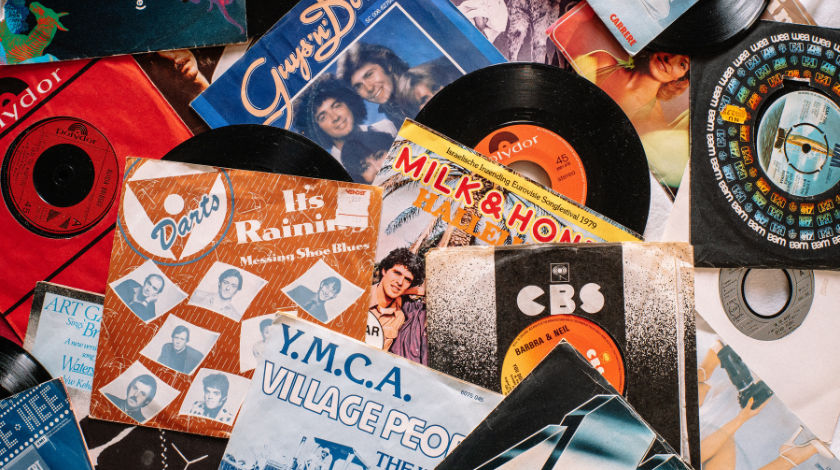
When you walk into a dusty old record store, your eyes naturally gravitate toward the vibrant, the iconic, and the beautiful. You see the prism from Pink Floyd or the stark white of The Beatles’ White Album. But every so often, you stumble upon something so visually offensive that it makes you stop and stare for all the wrong reasons. We have all seen them. I am talking about those album covers that look like they were slapped together in five minutes by someone who had never even heard of the word “aesthetic.” Whether it is a poorly cropped photo of a middle-aged man in spandex or a chaotic mess of neon fonts that hurt your brain, bad album art is a fascinating part of music history.
The question is, can these disasters be saved? Redesigning notoriously bad album covers is not just a fun exercise for bored graphic designers on the internet. It is a deep dive into the psychology of marketing and the relationship between sound and sight. When a band releases a masterpiece of an album but wraps it in a sleeve that looks like a high school art project gone wrong, they are doing a massive disservice to their own work. I have spent years looking at these covers and wondering what the artists were thinking. Was it a joke? Was it a lack of money? Or was it just a total absence of taste? In this article, we are going to explore why these covers failed and how we can use modern design principles to give them the face-lifts they so desperately need.
Why Do Bad Album Covers Even Exist?
It is easy to look at a cover from 1984 and laugh at the cheesy effects, but we have to understand the context. Back in the day, high-level graphic design was expensive and time-consuming. There was no Canva or Adobe Creative Cloud. If a band was on a small label, they often had to rely on a local photographer or even a friend who “knew how to draw.” This led to a lot of literal interpretations of band names. If a band was called “Iron Claw,” you could bet money that the cover would feature a very poorly drawn metal hand. This literalism is one of the biggest reasons why old album covers age so poorly. They lack nuance and subtlety.
Furthermore, sometimes the “badness” comes from the artist’s own ego. There are many stories of famous musicians who insisted on a specific vision, even when everyone in the room told them it was a terrible idea. When a musician becomes big enough, they often surround themselves with “yes-men” who are afraid to tell them that their “genius” idea for a cover actually looks like a collage of trash. This is how we end up with covers that are confusing, cluttered, or just plain weird. From a design standpoint, these covers fail because they do not communicate the mood of the music. An album should look like it sounds. If the music is dark and heavy, but the cover is bright pink with Comic Sans font, there is a massive disconnect that confuses the audience.
The Technical Failures: Typography and Composition
When I look at a “bad” cover, the first thing I notice is usually the typography. Fonts are powerful. They carry a mood and a history. Many notoriously bad covers use fonts that are completely inappropriate for the genre. For example, using a futuristic, digital-looking font for a folk-rock album feels jarring. It breaks the immersion. In many redesign projects, the simplest way to fix a cover is to just change the font. By moving away from “trendy” fonts of the past and choosing something timeless and legible, you can instantly make an album look professional.
Composition is another huge factor. A lot of old covers suffer from what I call “the middle of the page” syndrome. This is where the band members just stand in a straight line in the dead center of the frame, looking at the camera with blank expressions. There is no movement, no depth, and no story being told. Modern design focuses on the rule of thirds, leading lines, and negative space. When we redesign these covers, we often crop the images in more interesting ways or use silhouettes to create a sense of mystery. You want the viewer’s eye to travel across the cover, not just get stuck on one boring point in the middle.
Case Study: Redesigning the 80s Metal Aesthetic
Let’s talk about 80s heavy metal for a moment. This genre is the undisputed king of bad album art. We have all seen the covers with muscular warriors fighting giant snakes or dragons that look like they were made of play-dough. While there is a certain nostalgic charm to these, they often look more like children’s toys than serious musical statements. Take a band like Pantera. Their early stuff, like Metal Magic, features a weird tiger-man hybrid that looks like a cartoon character. It is hard to take the music seriously when the visual identity is that goofy.
If I were to redesign a cover like that, I would lean into the intensity of the music rather than the literal imagery. Instead of a literal tiger-man, perhaps I would use abstract textures that mimic fur or claws, using a dark, moody color palette of deep oranges and blacks. I would use heavy, bold typography that feels like it has weight. The goal is to capture the “feeling” of the music without being so literal that it becomes a joke. By stripping away the clutter and focusing on a singular, powerful image, you create something that stands the test of time.
The Modern Mess: Over-Design and the Digital Age
Bad design did not stop with the invention of the computer. In fact, some might argue it got worse. With tools like Photoshop, people began to over-design. They would add glows, shadows, gradients, and filters to every single element. This results in a cover that feels “noisy.” There is too much going on, and the human brain does not know where to look. We see this often in the early 2000s rap and pop scenes, where covers were packed with bling, flashy cars, and busy backgrounds.
A great redesign for a busy modern cover involves the principle of “subtraction.” Many designers believe that a design is finished not when there is nothing left to add, but when there is nothing left to take away. If you take a cluttered cover and remove 70 percent of the elements, you usually find a much stronger image buried underneath. Using a minimalist approach can make even the most chaotic album feel premium. I often tell people that silence is just as important in music as the notes, and the same applies to design. Negative space is the “silence” of the visual world. It gives the important parts of the cover room to breathe.
The Role of Color Theory in Redesigning Disasters
Color is the first thing our brains process when we see an image. Many bad album covers fail because they use colors that clash or colors that do not match the genre’s vibe. Imagine a death metal album with a pastel yellow and baby blue color scheme. It just does not work. When I approach a redesign, I start by building a color palette that reflects the sonic qualities of the record. If the album is acoustic and warm, I look for earthy tones like browns, deep greens, and soft tans.
In many of the “worst” covers, the colors are often muddy or oversaturated. This usually happens during the printing process or due to poor lighting during the original photoshoot. To fix this, we can use modern color grading techniques. By adjusting the highlights and shadows, we can create a cinematic feel that makes the cover look like a piece of fine art rather than a cheap snapshot. A simple shift in color temperature can change a cover from “creepy and weird” to “moody and atmospheric.” It is incredible how much a little bit of color science can save a failing design.
Personal Opinions on “Ironic” Bad Art
There is a trend lately where bands intentionally make “bad” album covers. They want them to look like they were made in Microsoft Paint as a way of being “edgy” or “post-modern.” Kanye West’s The Life of Pablo is a famous example of this. It looks like a messy collage with overlapping text and random photos. While I understand the artistic intent, as a designer, it still bothers me. I believe that even if you want to be unconventional, there should still be a sense of balance and intent behind the chaos.
When people redesign these “intentionally bad” covers, they often find that the music actually benefits from a more structured visual. It is a risky move for an artist to put out a “bad” cover because it relies on the audience being “in on the joke.” If the listener does not get the irony, they just think the artist is lazy. Redesigning these covers allows us to see what the album would have looked like if it were treated with the same level of polish as the music itself. It bridges the gap between the experimental nature of the artist and the expectations of the listener.
The Importance of the “First Impression”
We are told from a young age not to judge a book by its cover, but we all do it anyway. In the world of streaming services like Spotify and Apple Music, the album cover is tiny. It is a small thumbnail on a screen. This makes design even more important than it was in the era of vinyl. A bad album cover today is even more detrimental because it has to compete with millions of other thumbnails. If your art is cluttered or ugly, people will just scroll right past it.
Redesigning these covers for the digital age means focusing on high contrast and simple shapes. A cover that looked “okay” on a 12-inch vinyl might look like a blurry mess on a smartphone screen. This is why many modern redesigns focus on bold icons and clear text. We want something that pops even when it is only an inch wide. This shift in how we consume music has changed the way we think about “good” and “bad” art. A “bad” cover today is one that is forgettable. A “good” cover is one that catches your eye in a split second.
Conclusion: Giving Music the Face It Deserves
At the end of the day, music is an emotional experience. The visuals that accompany that music should enhance that emotion, not distract from it. Redesigning notoriously bad album covers is a way of paying respect to the musicians who poured their hearts into the audio. It is about fixing the mistakes of the past and using our modern understanding of design to create something beautiful. Whether it is fixing a cheesy 80s metal cover or cleaning up a cluttered modern mess, the goal is always the same: to create a visual identity that is as powerful as the songs themselves.
Designers have the power to change how we perceive history. By reimagining these covers, we can give classic albums a second chance at a first impression. We can move away from the literal, the cluttered, and the garish, and move toward the symbolic, the clean, and the evocative. The next time you see a truly hideous album cover, do not just laugh at it. Try to imagine what it could have been with a different font, a better crop, or a more thoughtful color palette. Behind every bad cover is a great story waiting for a better visual to tell it.
Frequently Asked Questions
1. What makes an album cover “bad”?
A bad album cover usually fails because of poor composition, inappropriate font choices, or a disconnect between the visual style and the music’s mood. Technical issues like low-quality images or clashing colors also contribute to a “bad” rating.
2. Can a bad cover actually help an album?
Sometimes! “So bad it’s good” art can become a cult classic or a meme, which generates organic word-of-mouth marketing. However, for most professional artists, a bad cover is a barrier to being taken seriously by a wider audience.
3. What are the most common mistakes in DIY album art?
The most common mistakes include using too many different fonts, center-aligning everything without thought, and using “literal” imagery that lacks any metaphor or artistic depth.
4. How does the digital era affect album cover design?
Since most people see album art as small thumbnails on their phones, modern design emphasizes high contrast, bold shapes, and legibility over intricate, busy details that might get lost at a small size.
5. Is redesigning old album covers legal?
As a creative exercise or for a portfolio, it is generally fine. However, you cannot sell or officially distribute a redesign of someone else’s copyrighted work without permission from the artist or the record label.